Mark Godwin Design
Open Menu

NAS Collective
Brand Designer
1 Month
NAS Collective is a snowboarding apparel and video production brand founded by two veteran instructors with years of industry experience. Drawing on their deep understanding of rider needs and gaps within the market, they set out to create a brand that delivers apparel the industry has been missing where elevated style meets technical performance.
Alongside product development, NAS Collective remains committed to producing high-quality snowboard films that authentically represent the culture and progression of the sport.
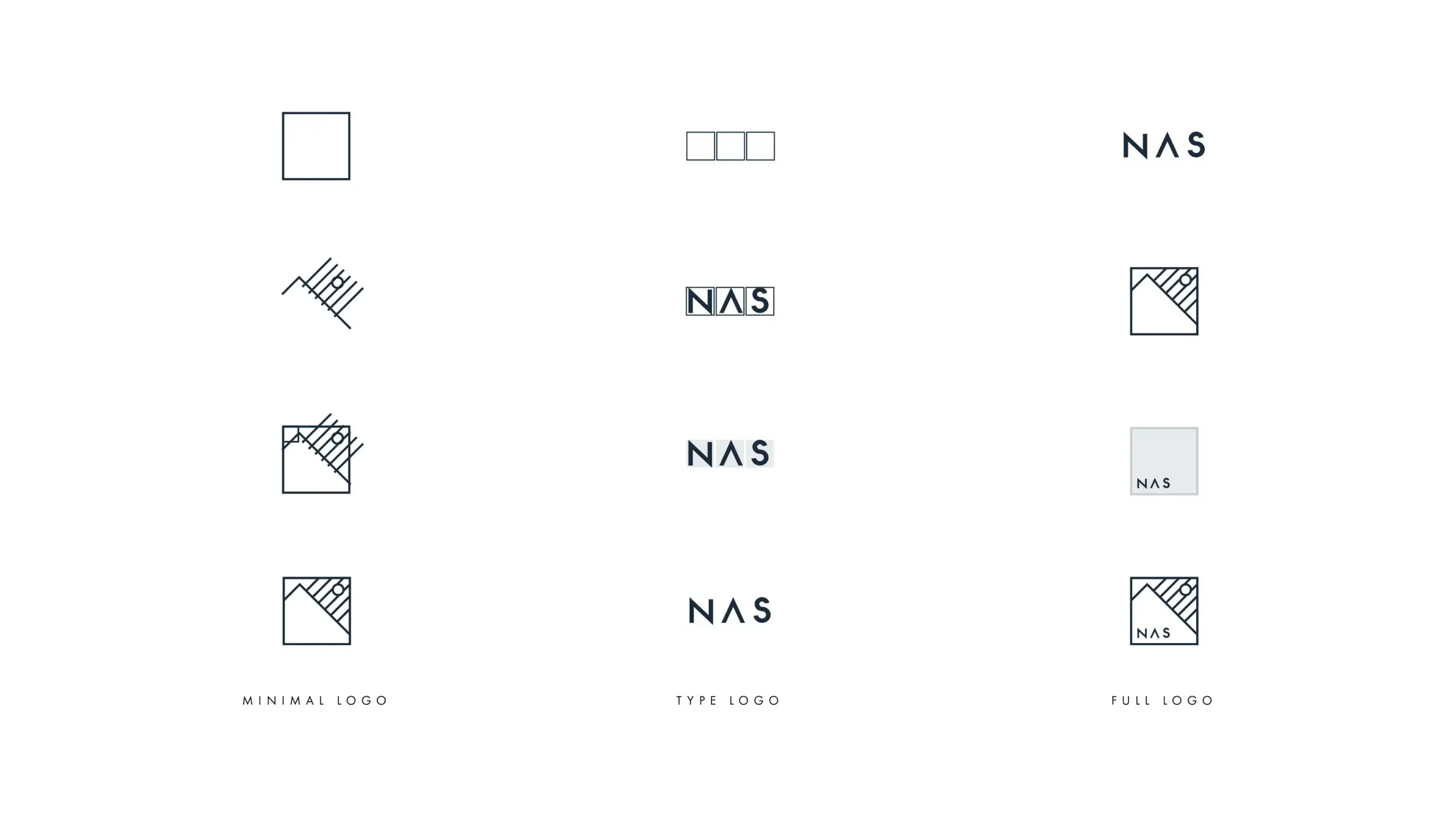
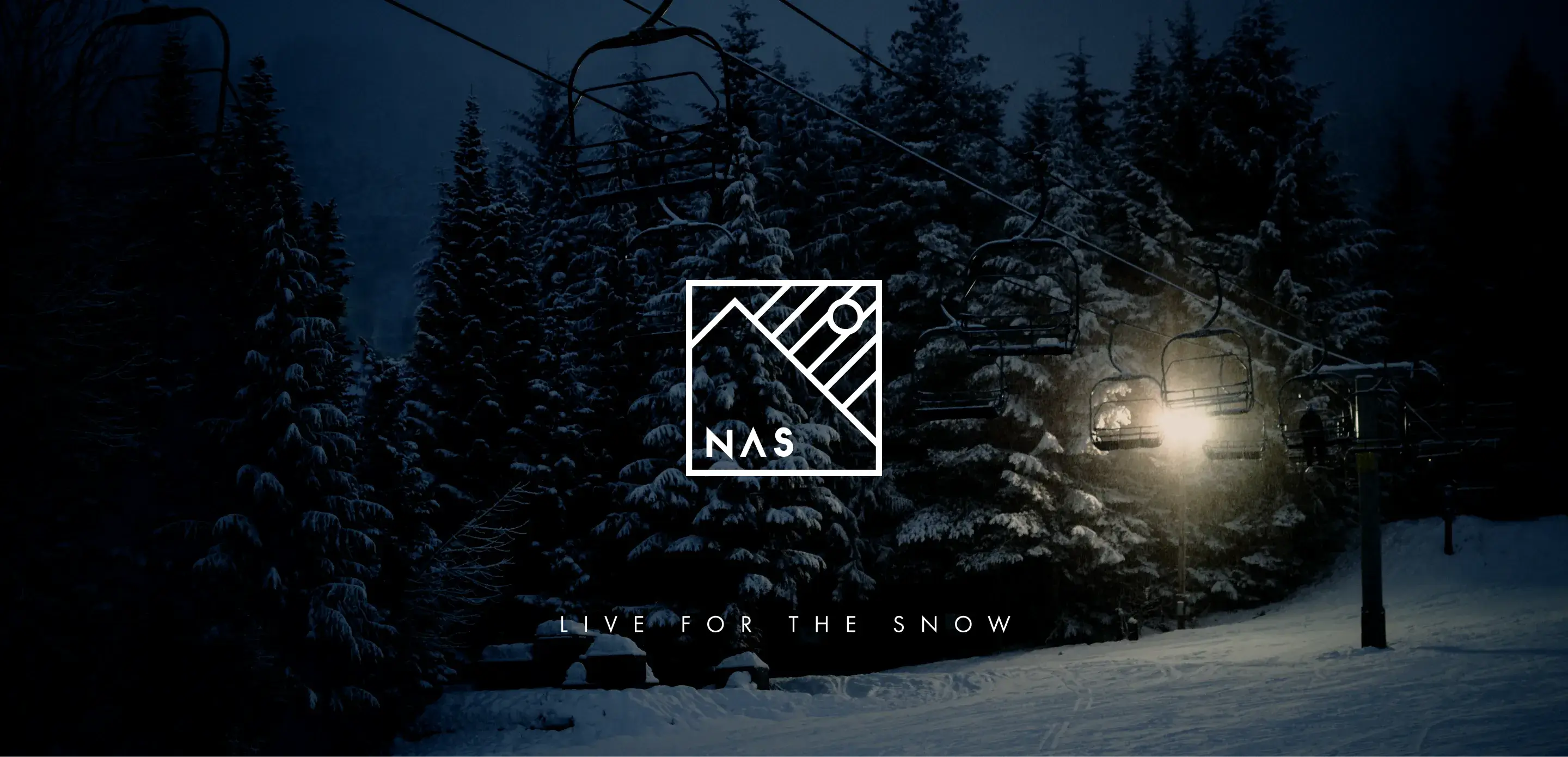
The NAS Collective logo was intentionally designed with a minimalist aesthetic to align with the clean, considered style of the apparel range.
The mark features a mountain silhouette with falling snow and the sun breaking through cloud cover, capturing the clarity and energy of a bluebird day. This concept was inspired by a moment experienced by one of the founders while snowboarding, when sunlight pierced through a snow flurry on the mountain.
To ensure flexibility across applications, the identity system was developed as a cohesive suite comprising a standalone logo mark, a refined wordmark, and a combined lockup integrating the NAS lettering. This approach allows the brand to adapt seamlessly across apparel, digital platforms, and motion graphics.
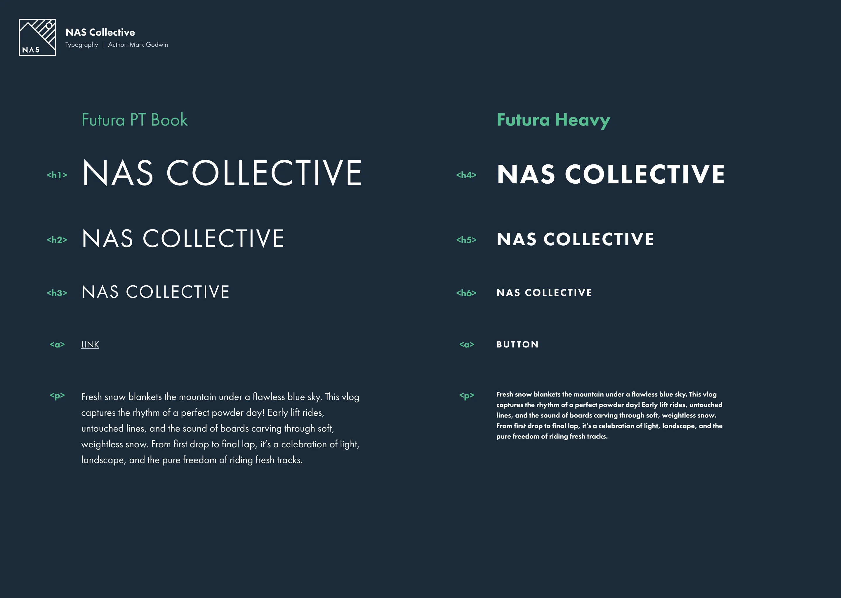
The typography was selected to reflect the brand’s modern streetwear sensibility while maintaining the technical precision associated with high-performance snowboard apparel. Its clean, contemporary structure aligns with the visual language of street culture and action sports media, while subtle detailing and strong geometric forms convey durability, engineering, and performance. This balance ensures the brand feels equally at home on the mountain, in film, and within urban environments.
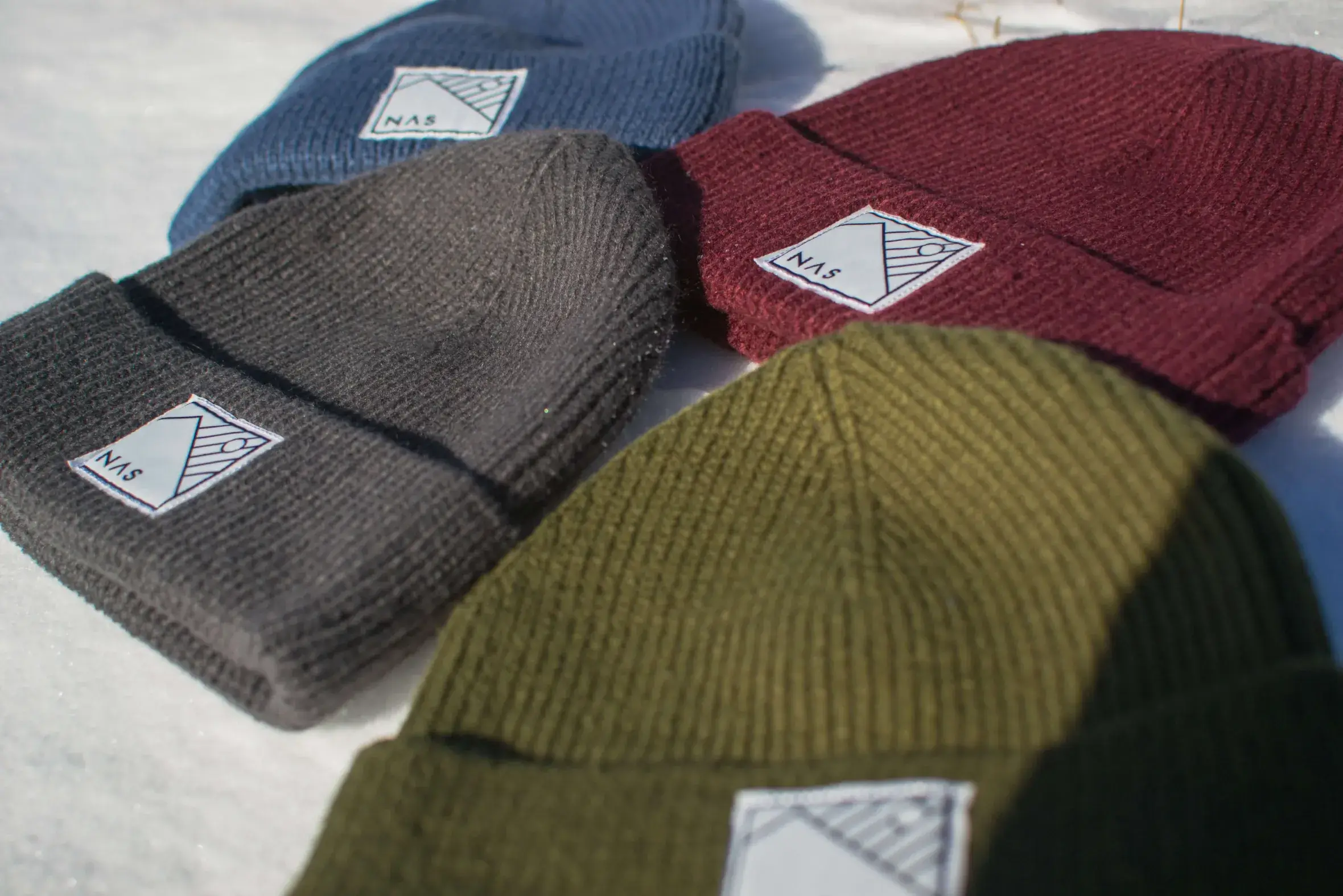
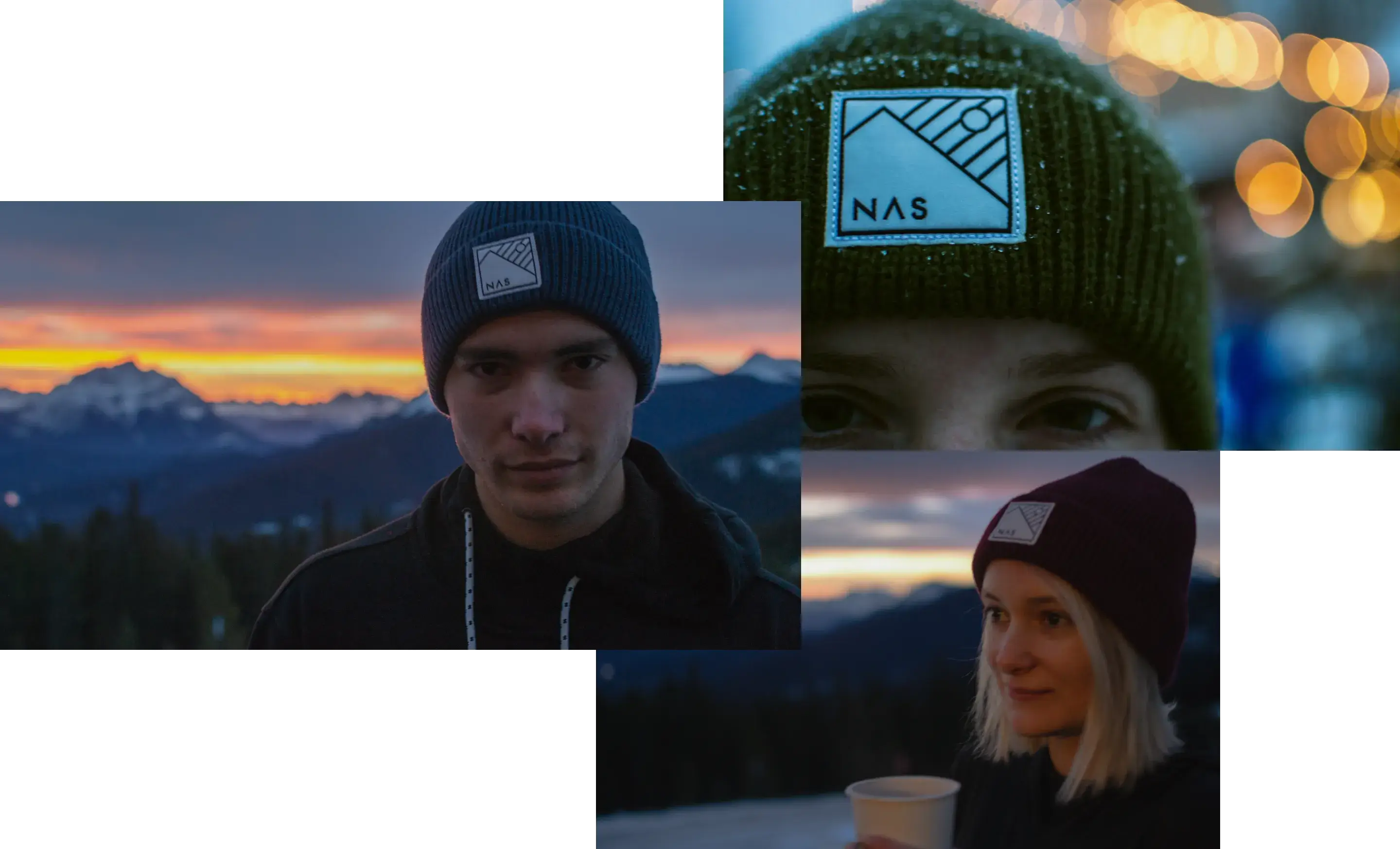
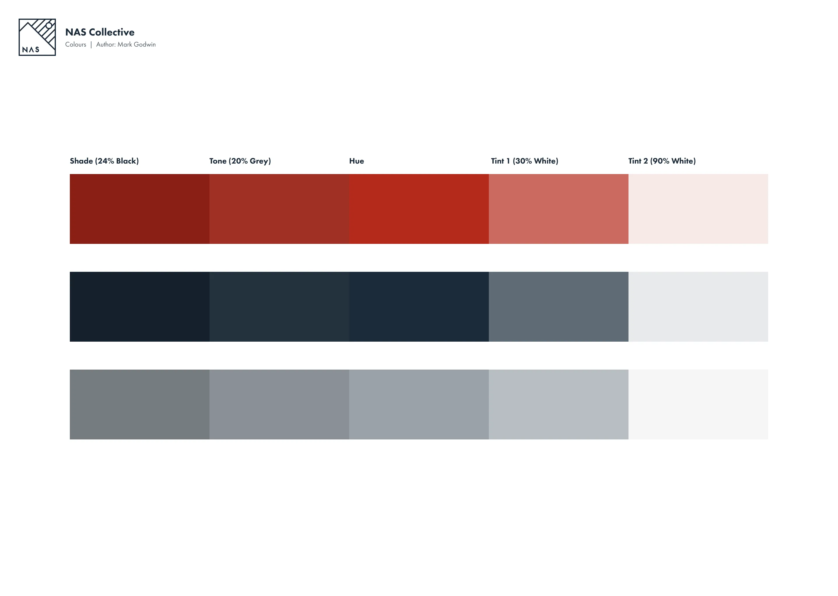
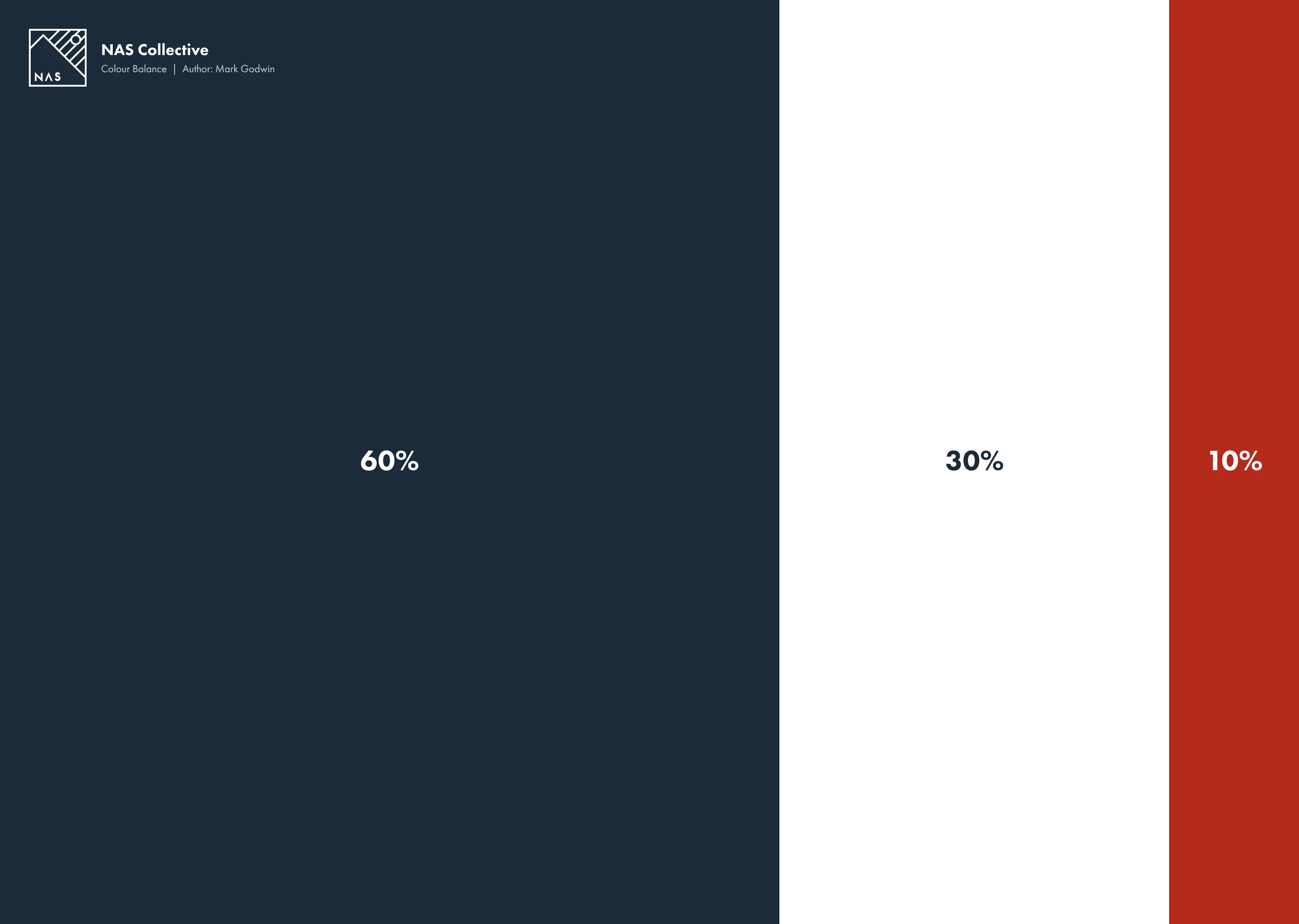
The dark blue and red colour palette draws directly from the founders’ years of coaching, referencing the tones commonly seen in instructor uniforms. This deliberate choice grounds the brand in experience and credibility, reinforcing a sense of authority, reliability, and technical expertise while maintaining a bold, confident visual presence.
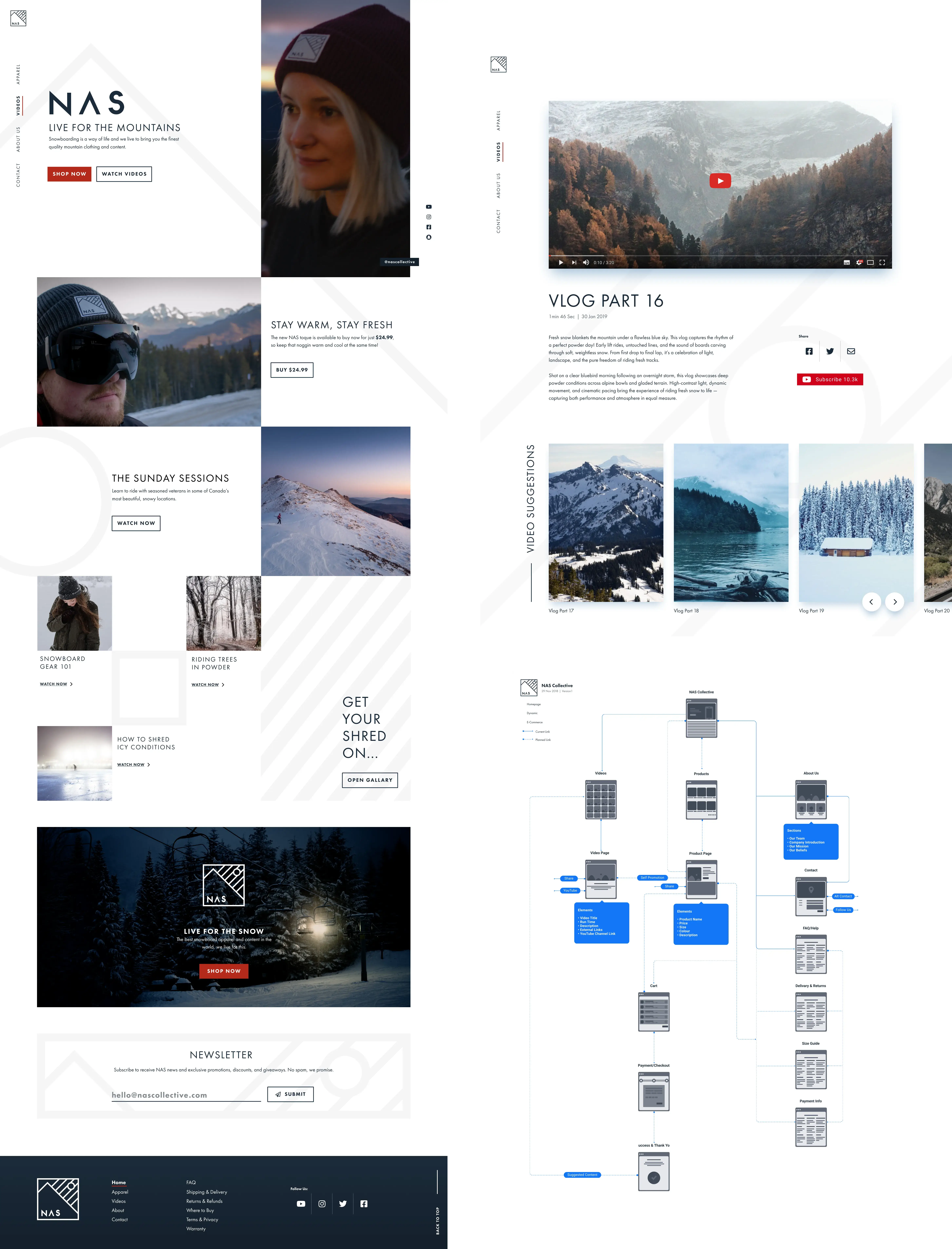
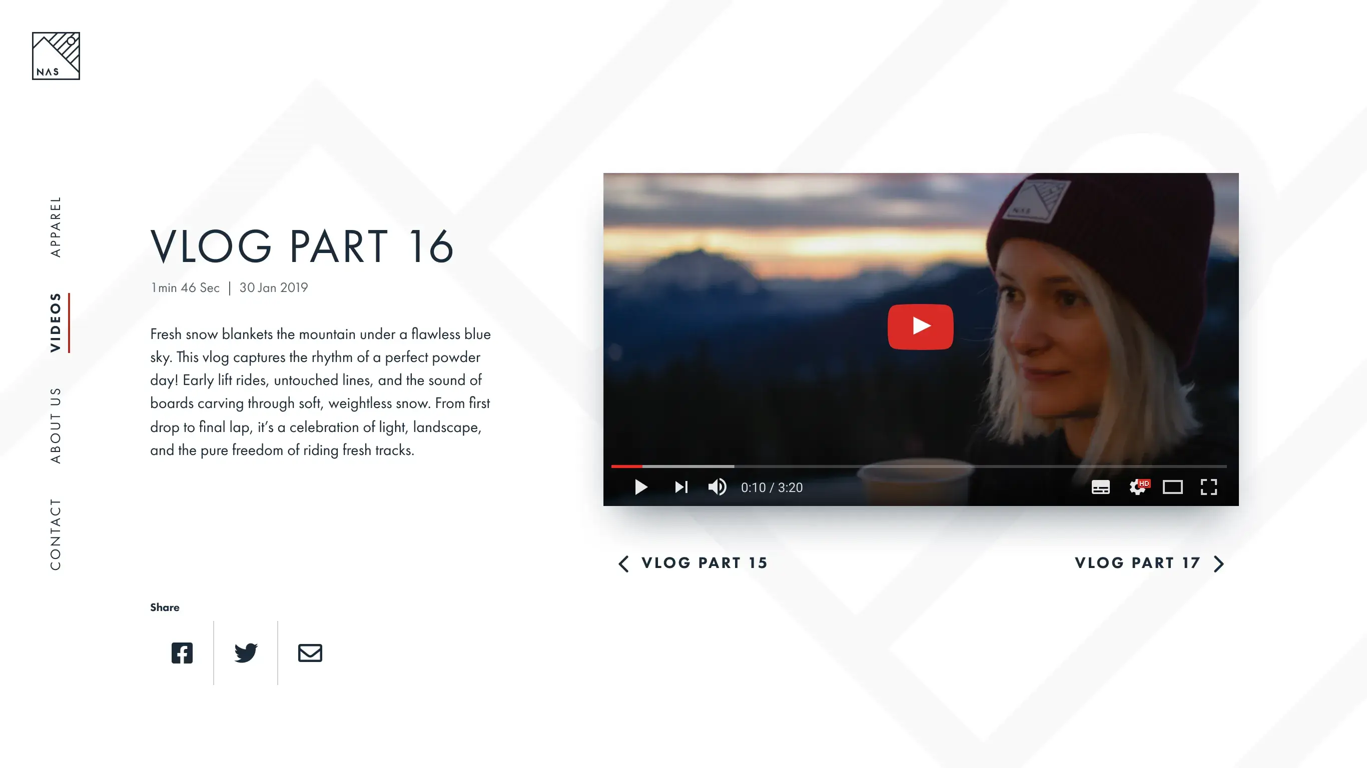
The brand extends into a purposefully minimal website experience designed to reflect the premium quality of both the apparel and video production. A restrained layout, generous use of negative space, and disciplined typography create a refined digital environment that reinforces craftsmanship and high production value.
The brand extends into a purposefully minimal website experience designed to reflect the premium quality of both the apparel and video production. A restrained layout, generous use of negative space, and disciplined typography create a refined digital environment that reinforces craftsmanship and high production value.
Clear, strategically positioned CTAs are integrated to support product conversion, encouraging apparel purchases without interrupting the immersive browsing experience. The result is a balanced platform that showcases an extensive library of high-production video while seamlessly guiding users toward key commercial actions.
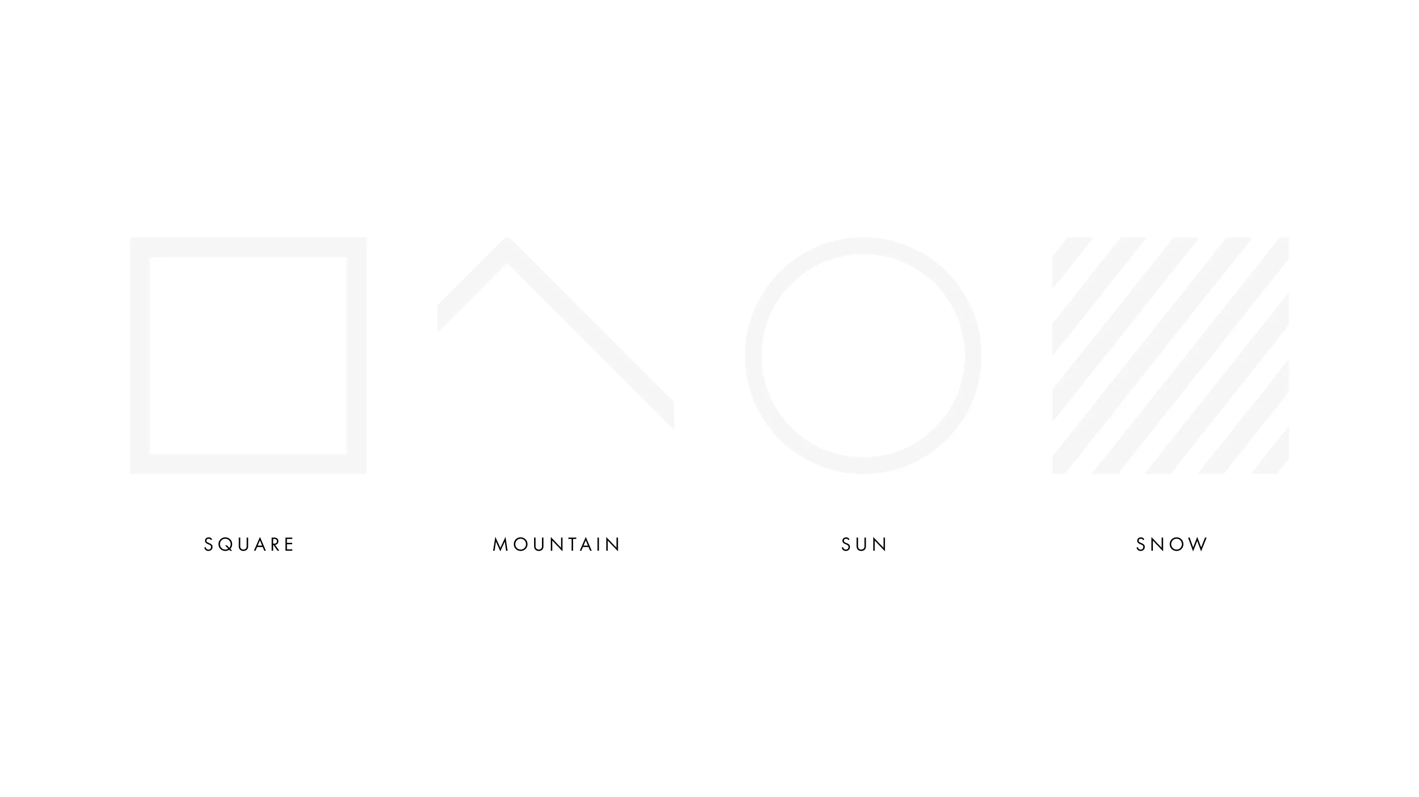
The logo was deliberately constructed within a square format to create a compact, highly adaptable mark that can be applied consistently across apparel. This contained structure ensures immediate recognition at a glance, whether embroidered, screen-printed, or used as a woven label. The square form also lends itself naturally to placement on garments, functioning effectively as a badge-style mark that feels considered and intentional.
Its minimal aesthetic reinforces the perception of quality and confidence. By stripping back unnecessary detail, the mark communicates refinement and durability, qualities synonymous with premium performance apparel. The restrained execution positions the brand alongside high-end sports labels, where simplicity, precision, and strong silhouette drive both recognition and perceived value.